I worked on the Papa L's Kitchen website to transform their digital experience, focusing on enhancing the website’s user experience and increasing online bookings. As part of this project, I researched and discovered and executed a full website redesign. The goal was to improve the overall customer journey, streamline navigation, and create a more seamless booking process, aiming to boost key performance metrics for the restaurant.
Papa L's Kitchen
Simplifying the User Experience and Boosting Bookings for Papa L's Kitchen
Boosting bookings and enhancing the user experience for Papa L's Kitchen
Papa L’s Kitchen offers a vibrant fusion of African flavours, providing customers with a unique dining experience. Whether private dining, team-building workshops, or catering, the restaurant delivers immersive storytelling through its diverse menu.
One problem though – the website’s navigation was complicated, the booking process unclear, and key information like location and opening hours difficult to find. With services like catering and private dining, the website needed to communicate offerings more clearly and allow for easy, direct bookings.
My challenge: make it easy for users to find what they need and book a table quickly.
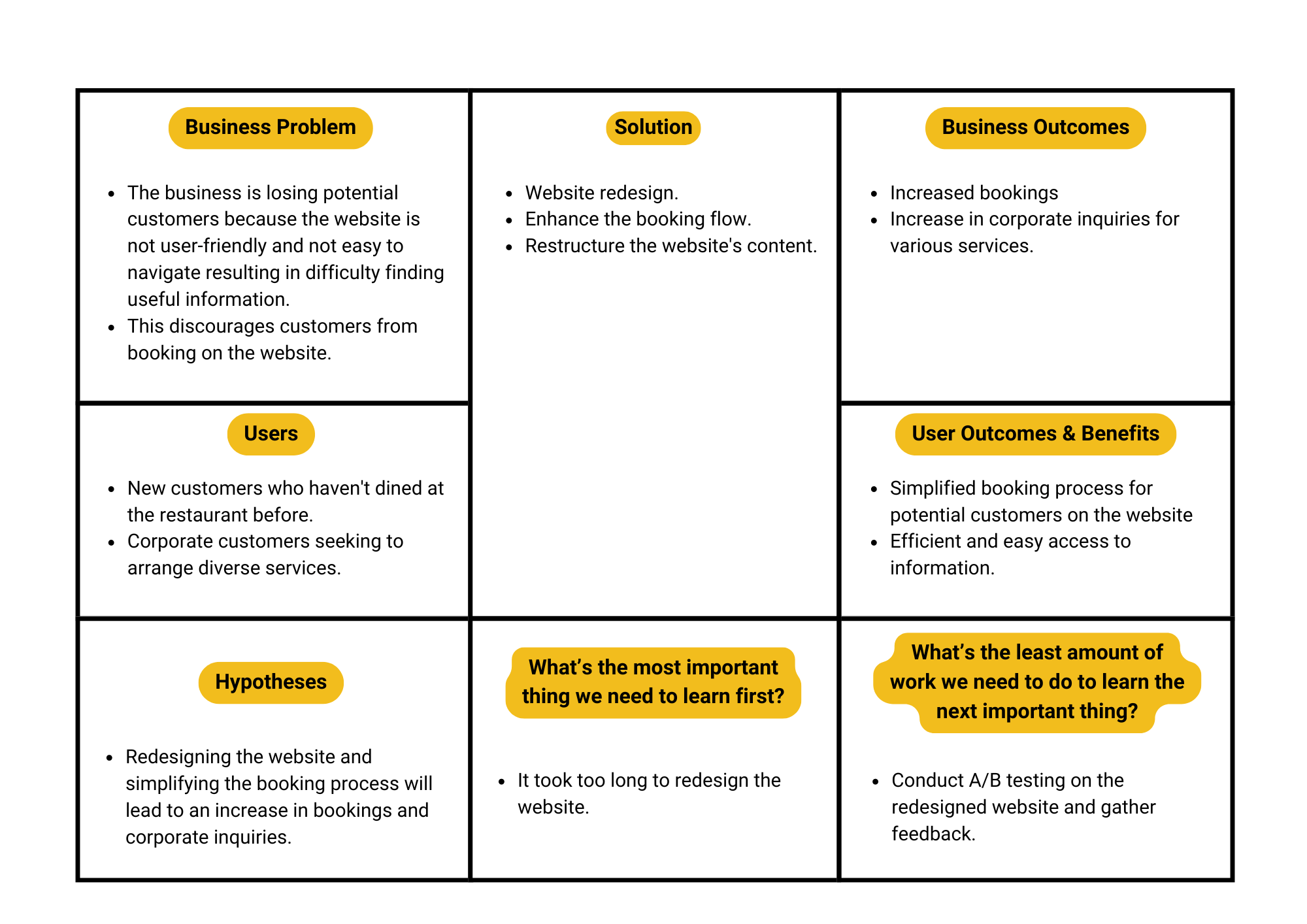
Using a Lean Canvas framework, I quickly identified the core issues and aligned the business goals with a redesign strategy. The focus was on simplifying navigation, seamless booking, and improving access to essential information. Through testing and iteration, it became clear that simplicity, not complexity, was the solution.
I streamlined the website, combining overlapping categories, adding direct access to the booking system from the homepage, and making location details more prominent. The result? A more intuitive user experience and a significant boost in online bookings and inquiries.

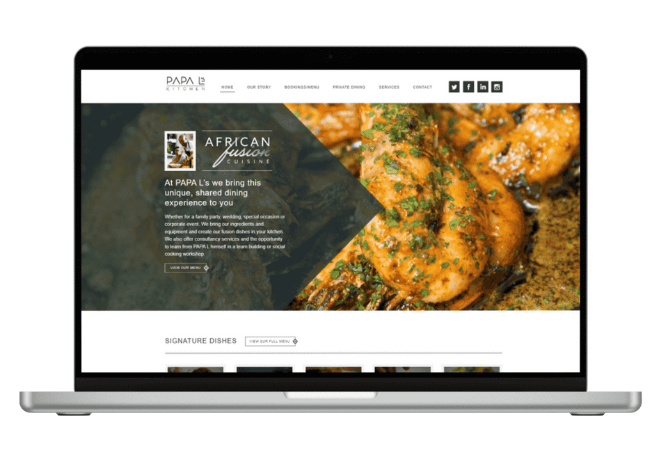
Design Review
What works and What could be improved.
Homepage
The homepage has got a very good quality food photography and branding which help with brand recognition.

There are links to the social media which helps with the social proof but there is no customer reviews which would encourage even more to dine in the restaurant.


The restaurant's location details and opening hours are not shown, making it difficult for customers and specifically larger groups to coordinate and ensure accessibility.
Navigation
Complicated and confusing navigation. Some of the services could be combine under one option.

There is no option to book a table in teh navigation section. The booking process is confusing and its not clear how to do it.


The “Private Dinning” and “Services” could be combined which would help to find all information in one place
Menu
In case someone would like to organise a bigger party there is not possibility to download the pdf version and share with other participants.

There is a possibility of checking the dishes only for vegan and vegetarian, with meat, fish which makes it easier in case of the bigger parties and accommodate diverse dietary preferences and simplifying the selection process for everyone involved.


Mobile
The website doesn't look appealing on the mobile. There is a lot of text but not too many visuals which would give a glimpse of the restaurant offerings.

Overall Aesthetics
Too much and repetitive information which make it difficult to find the necessary information.

There are part of the text which is overlaying and its difficult to read.


Some of the website elements, like email address, are not clickable, which makes it difficult to contact the restaurant.
User journey
I’ve mapped a flow of booking a table.

The booking journey is pretty straightforward forward, although there is no possibility to go into the booking from the homepage.


Site map
After analyzing the restaurant's website and its direct and indirect competitors, I developed a website information architecture that creates a seamless experience, generating leads.


A user is not able to freeze GIFs and other moving objects.

Menus should be tagged for assistive technology.

Letter spacing should be wide enough to be readable.

Font sizes should be large enough to be readable

Disabling zoom function.
Accessibility
I’ve analysed the website using PageSpeed service for any performance issues, which are likely to affect accessibility and conversion rates. The website performance is average at the moment and there could be taken some steps to optimise it.
Performence
.png)
.png)
.png)
After analyzing the restaurant's website and its direct and indirect competitors, I developed a website information architecture that creates a seamless experience, generating leads.

Background and foreground colours do not have a sufficient contrast ratio.
.png)
Usability testing

Scenario walkthrough.
I’ve set up a remote usability test on Zoom with my teammate and completed a set of tasks on the website.
.png)
User liked the website's design and hero image, but found the carousel lacking. They appreciated detailed info on dishes, reviews, and services.
.png)
The participant gave a low rating due to difficulty in finding location, opening hours, booking, and menu details. They were frustrated with the absence of information on the homepage, contact, and services sections.
.png)
Booking a table was easy yet challenging. The participant criticized the small size of the "Book Now" button on the homepage, expressing concerns about potential oversight. The booking process received a rating of 6 or 7 out of 10.
.png)
Booking a table was easy yet challenging. The participant criticized the small size of the "Book Now" button on the homepage, expressing concerns about potential oversight. The booking process received a rating of 6 or 7 out of 10.
Redesign
After conducting usability testing and analyzing the findings, I began working on redesigning the website. The previous website had been a bit outdated, so it was essential to create a more modern aesthetic.
After conducting usability testing and analyzing the findings, I began working on redesigning the website. The previous website had been a bit outdated, so it was essential to create a more modern aesthetic.
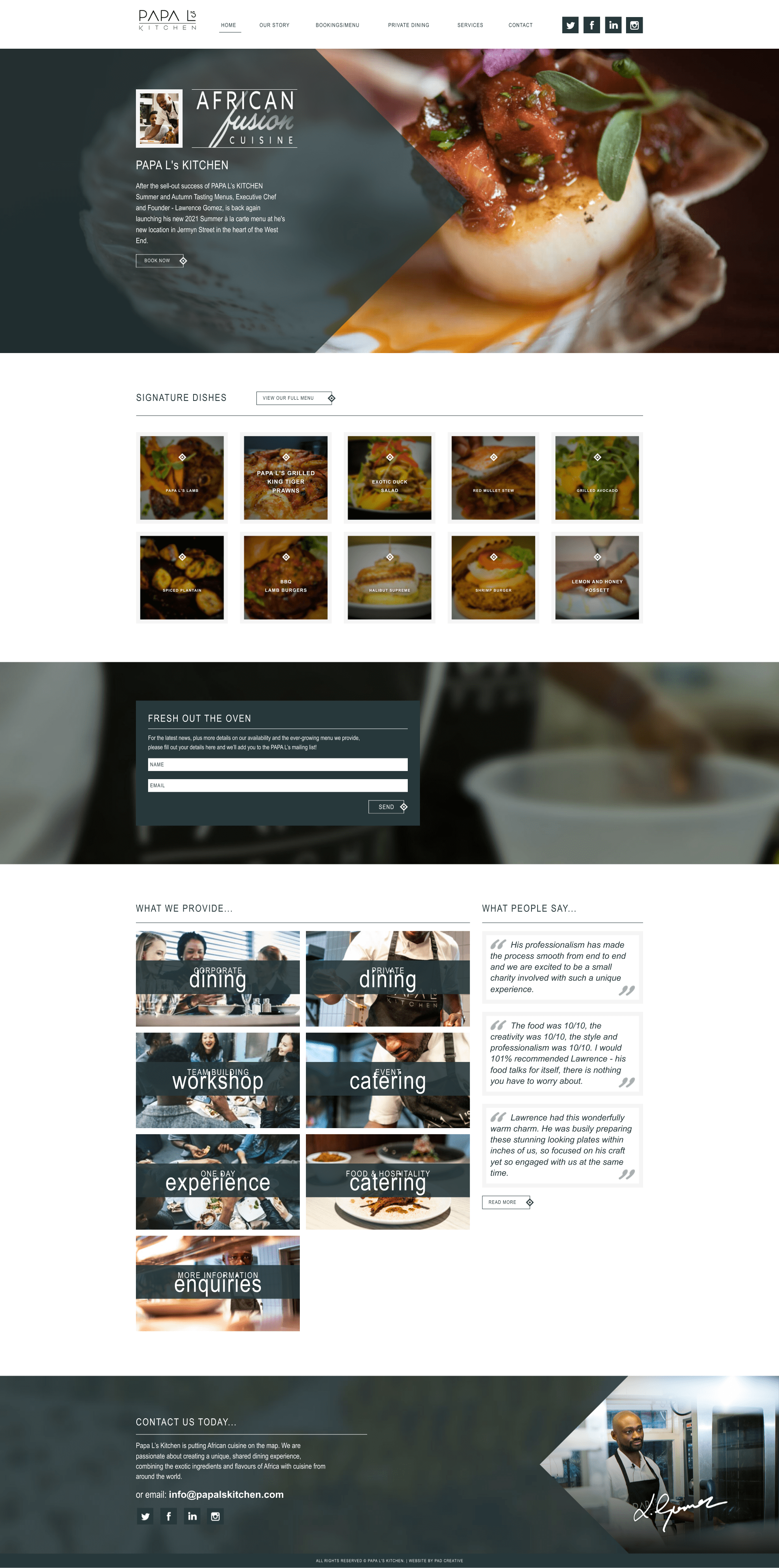
Before
Homepage
-
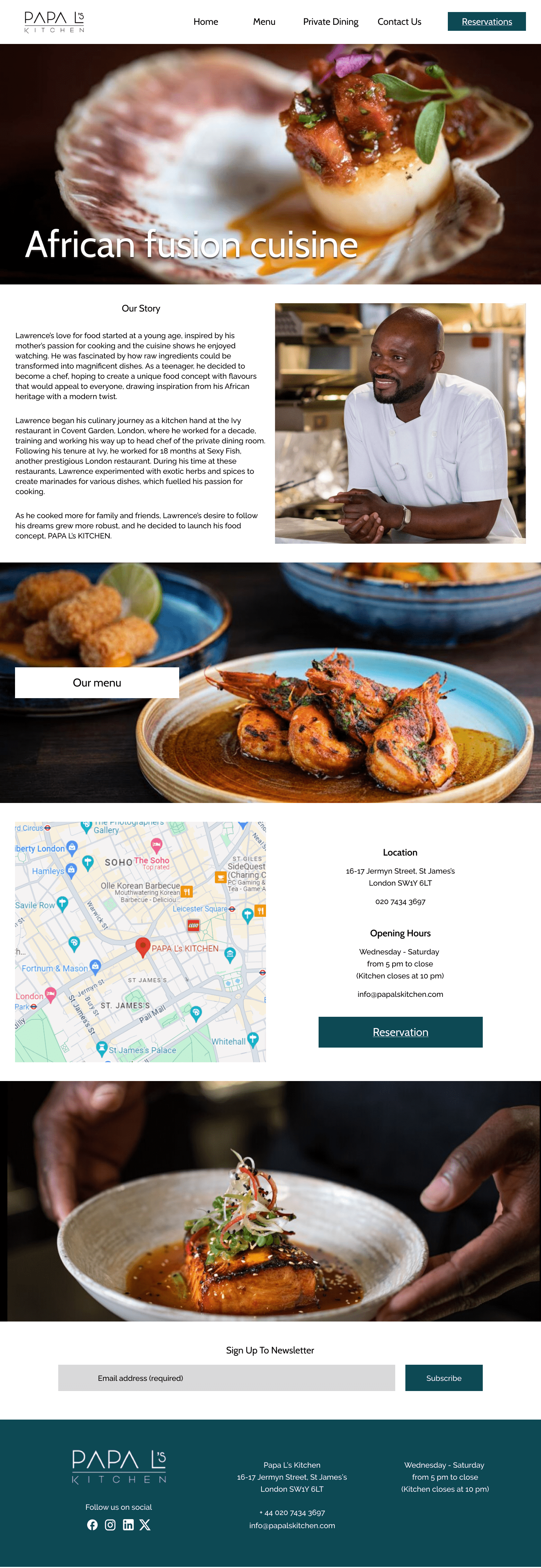
Simplified the navigation and added the option to make a reservation from the homepage.
-
Included is the “Our Story” section as this will help build emotional connections and differentiate the brand.
-
I have added the option to check the menu, which will allow potential customers to quickly view food and drink offerings and make decisions before visiting.
-
I added the map, location, and opening details for potential customers for easy access.
-
Added more photos of the dishes to make it more visually appealing and showcase the menu.
-
Added the contact information in the footer of the website.
After
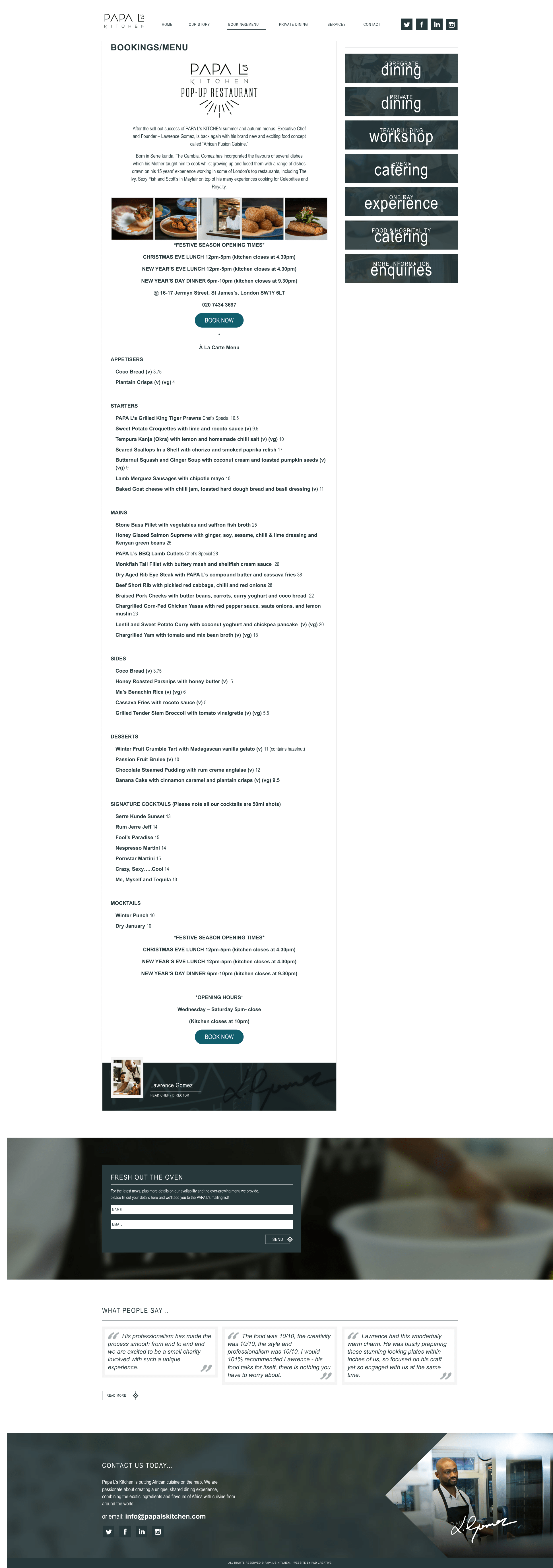
Before
Menu page
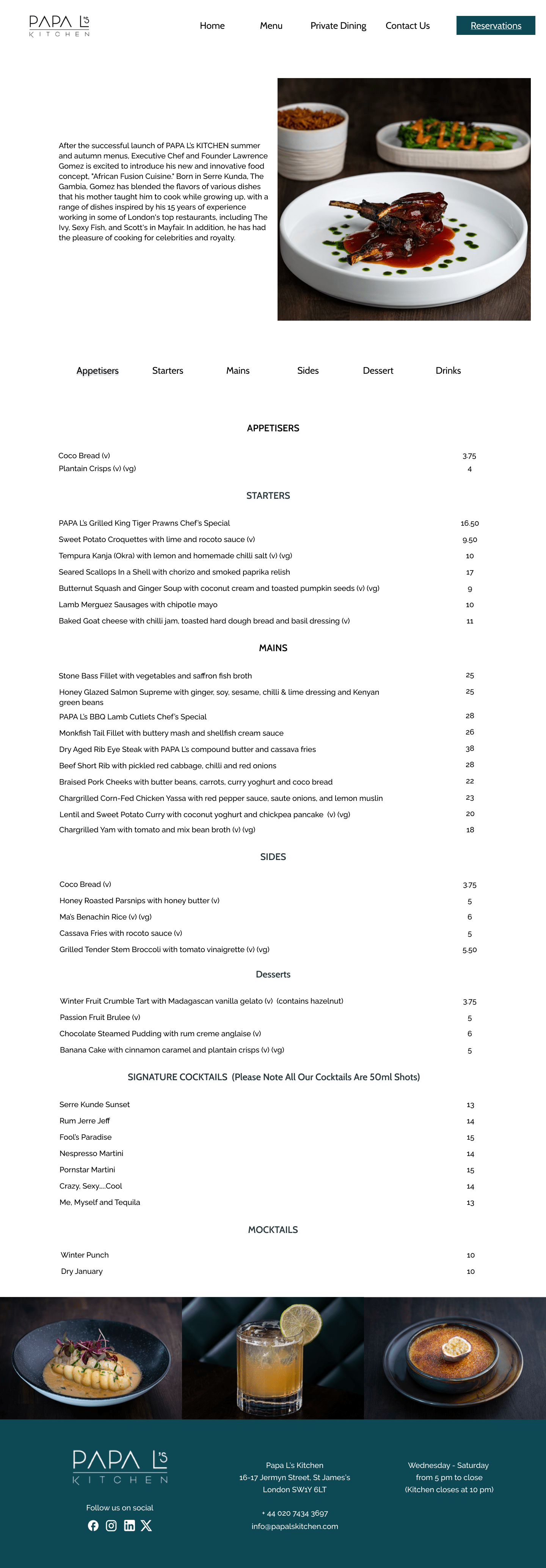
After
-
Minimised visual distractions by removing the side bar.
-
Added the option to quickly check different categories on the menu.
-
Simplified the design, made it easier, and made the menu clearer.
-
Added photos of the dishes and the cocktails to make it more visually appealing.
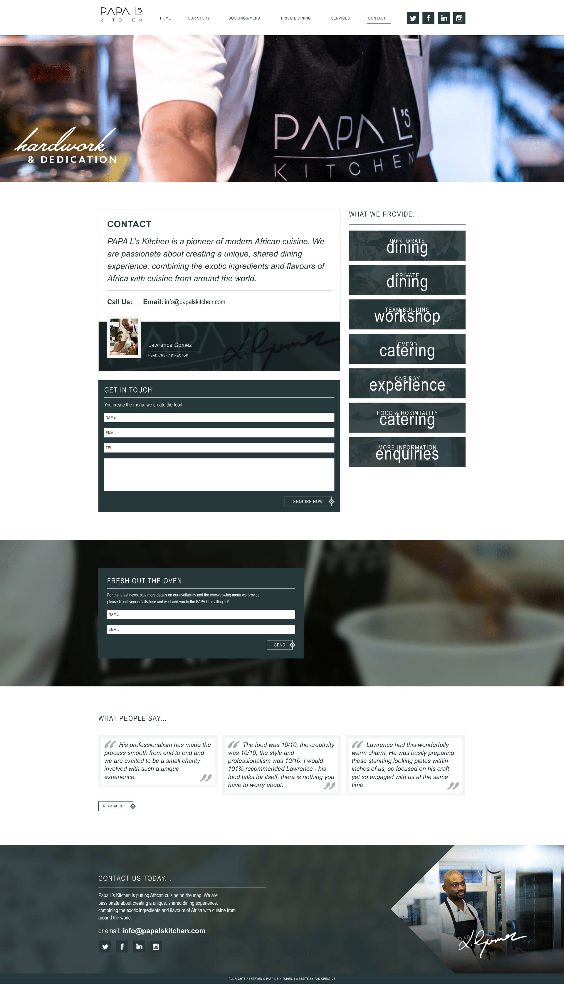
Before
Contact page

After
-
Added the location and opening hour details.
-
Reduced the amount of the information on this page to minimise distractions.
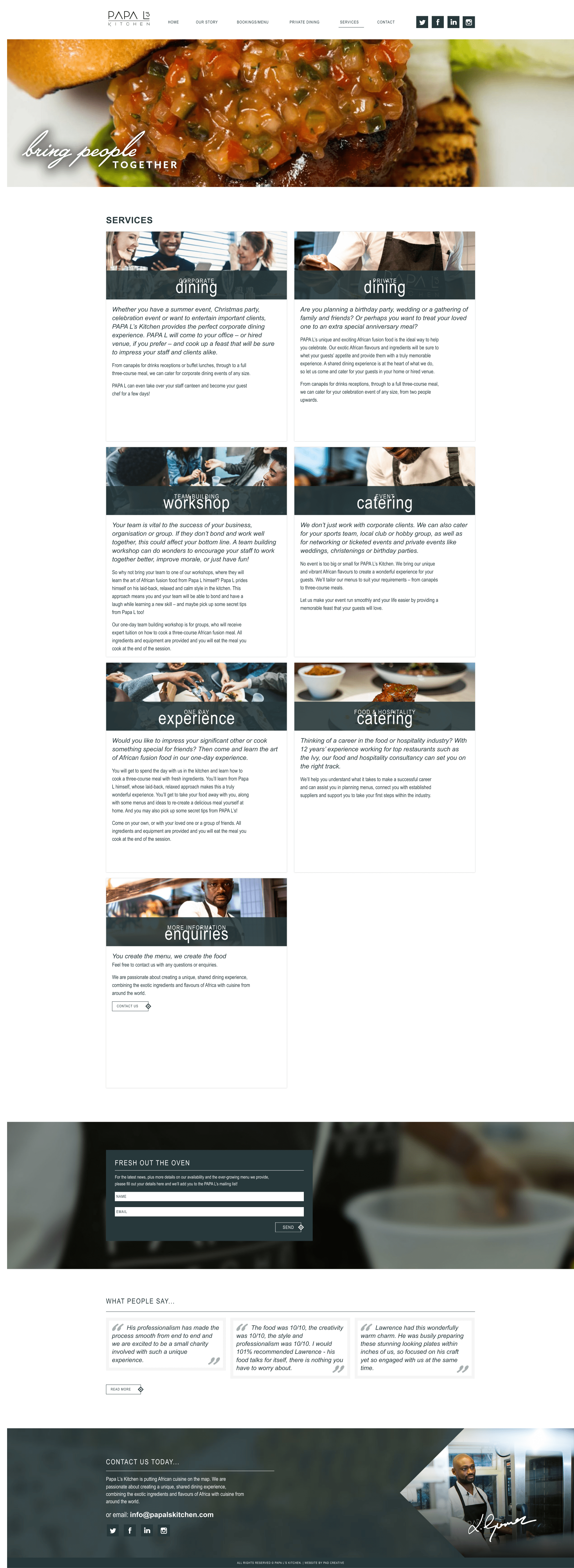
Before
Services
After
-
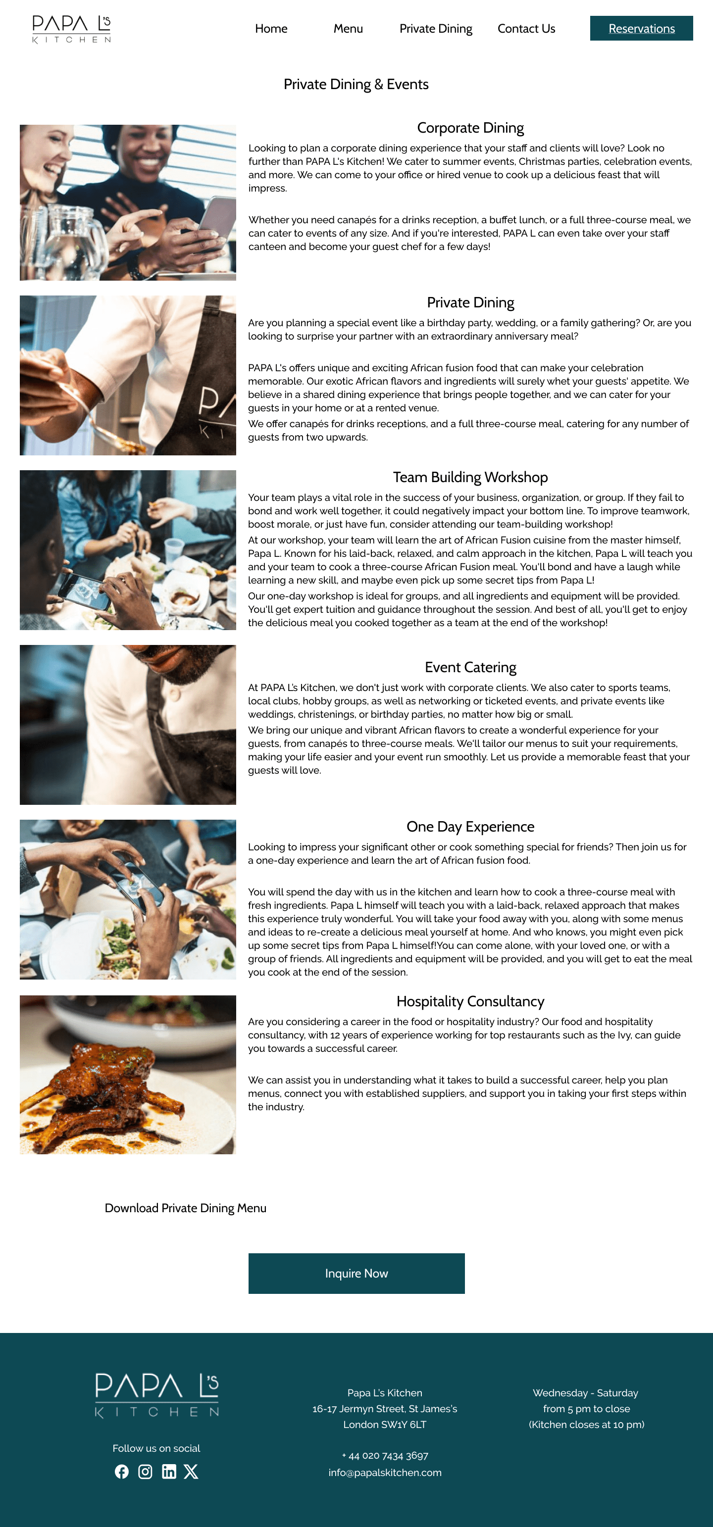
Changed the layout of the page and listed the available services one under another to make it easier to read.
-
Added the option to download the PDF version of the menu to make it easier for the event organizer to share with attendees.
-
Included the option to make an inquiry for the reservation.
A/B Testing
Homepage and service page


The redesign is visually more appealing.
.png)
I’ve set up an A/B test using Lyssna.com platform to test which version of the homepage and the service perform better.
.png)
New variant has a 56% compare to the old version.
Additional question was about the ease of finding the location on the homepage.
.png)
4% of the participants said that it was easy to find the location details on the homepage.

The redesign of the homepage made it simpler to find the location information.

What I've learned
The A/B test confirmed that the website needed a redesign, and the new variant was preferred for both the homepage and the services page.
The new layout is simple and modern, and there are food photos that make the website more visually appealing.
.png)
The navigation section is more organised, and some of the information was deleted to make it less distractive.
.png)